FilterChip
import { FilterChip } from "@material";export component Example inherits Window { width: 200px; height: 100px; background: transparent; FilterChip { text: "Filter"; icon: @image-url("../icons/filter.svg"); width: 100px; height: 32px; }}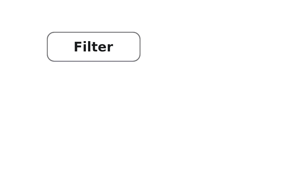
A FilterChip is a chip that can be toggled on and off to filter content. When selected, it displays a checkmark icon and changes its appearance to indicate the active state.
Properties
Section titled “Properties”checked
Section titled “checked”bool (in-out) default: false
Whether the filter chip is in the checked (active) state.
enabled
Section titled “enabled”bool default: true
Whether the chip is enabled and can be interacted with.
has-focus
Section titled “has-focus”bool default: false
Whether the component has focus.
image default: the empty image
An optional icon displayed on the chip.
string default: ""
The text label displayed on the chip.
tooltip
Section titled “tooltip”string default: ""
A tooltip text that appears when hovering over the chip.
Callbacks
Section titled “Callbacks”clicked()
Section titled “clicked()”Invoked when the chip is clicked.
Functions
Section titled “Functions”clear-focus()
Section titled “clear-focus()”Clears the focus from the component.
focus()
Section titled “focus()”Focuses the component.
toggle()
Section titled “toggle()”Toggles the filter chip state between checked and unchecked.
© 2025 SixtyFPS GmbH