CheckBoxTile
import { CheckBoxTile, CheckState } from "@material";export component Example inherits Window { width: 140px; height: 100px; background: transparent; CheckBoxTile { text: "Option 1"; check-state: CheckState.checked; }}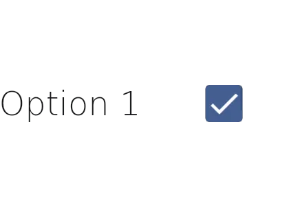
A CheckBoxTile is a control that combines a text label with a CheckBox. See CheckBox and ListTile for more information.
Properties
Section titled “Properties”check-state
Section titled “check-state”enum CheckState (in-out) default: the first enum value
CheckState
This enum is used to define the state of a checkbox.
unchecked: The checkbox is unchecked.partially-checked: The checkbox is partially checked.checked: The checkbox is checked.
The current state of the checkbox. Can be unchecked, partially-checked, or checked.
CheckBoxTile { check-state: CheckState.checked;}enabled
Section titled “enabled”bool default: true
Whether the checkbox is enabled and can be interacted with.
has-error
Section titled “has-error”bool default: false
Whether the checkbox should display an error state.
string default: ""
The primary text displayed in the list tile.
tristate
Section titled “tristate”bool default: false
Whether the checkbox supports three states (unchecked, partially checked, checked).
Callbacks
Section titled “Callbacks”checked-state-changed(check-state: CheckState)
Section titled “checked-state-changed(check-state: CheckState)”Invoked when the checkbox state changes.
Functions
Section titled “Functions”toggle()
Section titled “toggle()”Toggles the checkbox state. In tristate mode, cycles through unchecked → partially checked → checked → unchecked.
set-check-state(check-state: CheckState)
Section titled “set-check-state(check-state: CheckState)”Sets the checkbox state. If the state is partially-checked, the tristate property is set to true.
© 2025 SixtyFPS GmbH