TabBar
import { TabBar } from "@material";export component Example inherits Window { width: 400px; height: 100px; background: transparent; TabBar { width: parent.width; items: [ { icon: @image-url("../icons/share.svg"), text: "Home" }, { icon: @image-url("../icons/search.svg"), text: "Search" }, { icon: @image-url("../icons/settings.svg"), text: "Settings" } ]; }}slint
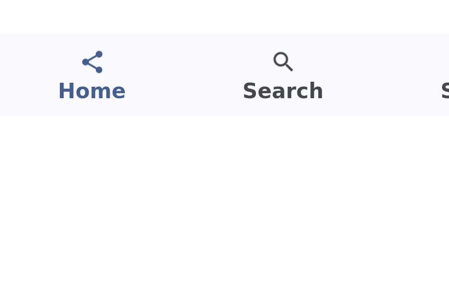
A TabBar displays a row of tabs for navigation between different views or content sections.
Properties
Section titled “Properties”current-index
Section titled “current-index”int (in-out) default: 0
The index of the currently selected tab.
[struct NavigationItem] default: a struct with all default values
NavigationItem
This structure represents a NavigationItem with an icon, text, badge, and empty badge.
icon(image): The icon to display in the item.selected-icon(image): The icon to display in the item when selected.text(string): The text to display in the item.show-badge(bool): Whether the badge is empty.badge(string): The badge to display in the item.
An array of tab items to display in the bar.
Callbacks
Section titled “Callbacks”index-changed(index: int)
Section titled “index-changed(index: int)”Invoked when the current-index changes.
© 2025 SixtyFPS GmbH