SearchBar
import { SearchBar } from "@material";export component Example inherits Window { width: 300px; height: 100px; background: transparent; SearchBar { placeholder-text: "Search..."; width: 280px; height: 56px; }}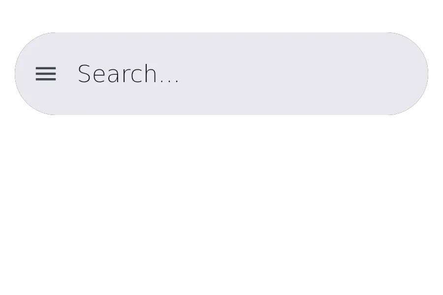
A SearchBar is a text input field designed for search functionality, with optional leading/trailing icons and avatar.
Properties
Section titled “Properties”avatar
Section titled “avatar”image default: the empty image
An optional avatar image displayed in the search bar.
avatar-background
Section titled “avatar-background”color default: #00000000
The background color for the avatar.
current-index
Section titled “current-index”int (in-out) default: 0
The index of the currently selected search result item.
empty-text
Section titled “empty-text”string default: ""
Text displayed when there are no search results.
has-focus
Section titled “has-focus”bool default: false
Whether the component has focus.
[struct ListItem] default: a struct with all default values
ListItem
This structure represents a ListItem with a text, supporting text, avatar icon, avatar text, avatar background, avatar foreground, and action icon.
text(string): The text to display in the item.supporting_text(string): The supporting text to display in the item.avatar-icon(image): The avatar icon to display in the item.avatar-text(string): The avatar text to display in the item.avatar-background(color): The avatar background color to display in the item.avatar-foreground(color): The avatar foreground color to display in the item.action-button-icon(image): The action button icon to display in the item.
An array of search result items to display.
leading-icon
Section titled “leading-icon”image default: the empty image
The icon displayed at the start of the search bar.
placeholder-text
Section titled “placeholder-text”string default: ""
The placeholder text displayed when the search bar is empty.
string (in-out) default: ""
The current text in the search bar.
trailing-icon
Section titled “trailing-icon”image default: the empty image
The icon displayed at the end of the search bar.
Callbacks
Section titled “Callbacks”action-button-clicked(index: int)
Section titled “action-button-clicked(index: int)”Invoked when a search result item action is triggered.
accepted(text: string)
Section titled “accepted(text: string)”Invoked when the user presses Enter in the search bar.
edited(text: string)
Section titled “edited(text: string)”Invoked when the text in the search bar changes.
key-pressed(event: KeyEvent) -> EventResult
Section titled “key-pressed(event: KeyEvent) -> EventResult”Invoked when a key is pressed in the search bar.
key-released(event: KeyEvent) -> EventResult
Section titled “key-released(event: KeyEvent) -> EventResult”Invoked when a key is released in the search bar.
Functions
Section titled “Functions”clear-focus()
Section titled “clear-focus()”Clears the focus from the component.
focus()
Section titled “focus()”Focuses the component.
© 2025 SixtyFPS GmbH